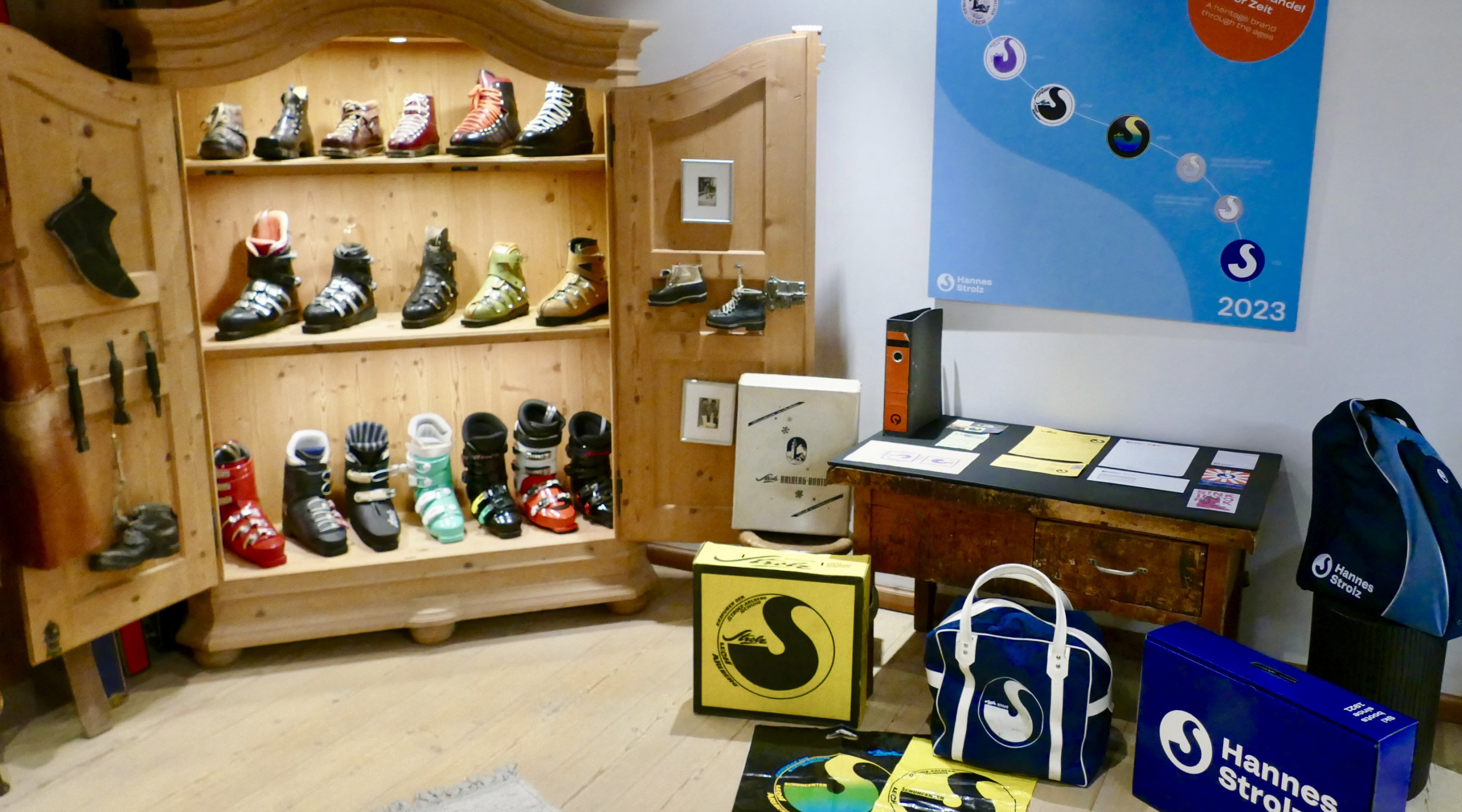
A Heritage Brand Through the Ages
Up to the 1950s, businesses frequently integrated iconic landmarks from their towns or regions into their logos. In the case of "Strolz Arlberg Schuhe Lech", the old church of Lech was a central feature in the company's emblem and was stitched as a label on their ski boots.
During the 1970s, the letter "S" from the Strolz family name was graphically transformed into a ski track, resembling the graceful arc of a ski turn. This logomark graced ski boot boxes, shopping bags and more, before being replaced with a typographic logo.
In 2021, the year marking the 100th anniversary of Strolz ski boots, Hannes Strolz relaunched the company as an independent brand and revived the original logomark, artfully combining tradition with contemporary style.
In the revamped version of the emblem, the "S" is centered, so it no longer connects to the top edge of the circular frame. The transparent area can be changed to accommodate various backgrounds, offering remarkable flexibility in its applications. Paired with a modern typeface, the updated logo gains enhanced legibility and exudes a more dynamic, sporty feel.
This circular logomark is also utilized with a modified twist in the sub-brand "POP by Hannes Strolz", typing it back to the primary brand.
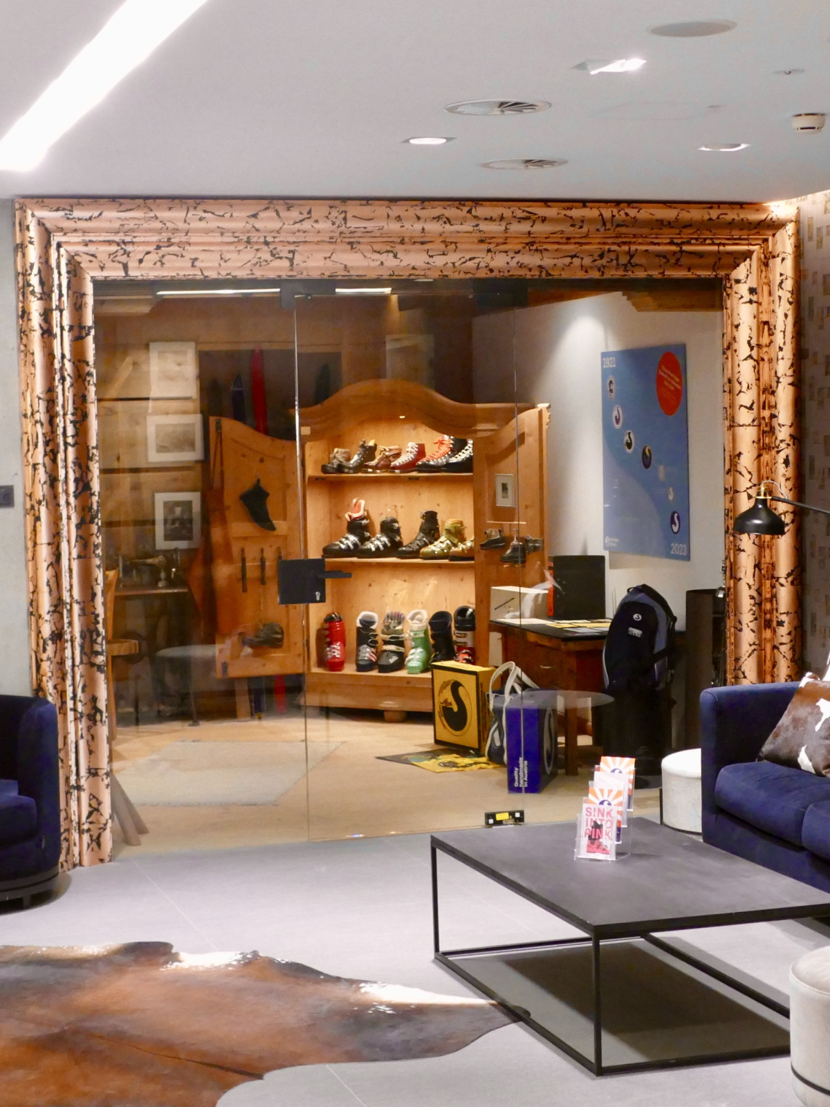
Take a look inside or even let Hannes Strolz personally guide you through the museum (Wednesdays from 4:00 - 6:00 p.m.).